CASE STUDY
A 960% usage lift on Systembolaget's app
Sweden's state-owned alcohol retail monopoly. By 2021, its app had outgrown its scope — misaligned with the website, cluttered with unused features, and frustrating at every key journey.
The app had been built and extended by different teams over several years, each making isolated decisions. What it produced was a product that felt disconnected from the website, carried features nobody used, and made the most common tasks harder than they needed to be.
I set the design direction from day one: align the app with the web platform, cut what wasn't earning its place, and rebuild the core journeys around how customers actually used the product. That meant leading discovery, defining the research approach, owning the prioritisation framework, and staying accountable for quality through to launch.
Project goals
Align platforms
Establish visual and functional parity between the app and Systembolaget.se. Moving between them should feel seamless, not like switching products.
Fix core journeys
Redesign store selection, product discovery, and shopping list management: the three flows customers used most and found most frustrating.
Drive adoption
Turn a product people tolerated into one they reached for. Measure the shift.
How I led the process
Data before opinions
I started with quantitative analysis of the existing app: usage rates, screen drop-off, and feature engagement. That produced a ranked map of failure points before a single research session was booked, and gave me hard evidence to challenge internal assumptions. Several features the team wanted to protect had near-zero real usage. They were cut.
A multi-method research programme
I designed the research approach: a heuristic evaluation across every key flow, interviews with customer support staff who saw recurring pain firsthand, and user surveys validated against the quantitative data. Each method earned its place. The heuristic pass exposed structural problems. The support interviews surfaced emotional friction. The surveys confirmed both at scale.
Interaction logic locked before visual design
I wireframed and usability-tested every significant flow change before any high-fidelity work started. That discipline eliminated a full category of late-stage rework and meant the visual design phase moved at a completely different speed.
Prioritisation as a design responsibility
With over 20 identified problems, sequencing mattered as much as solving. I built a scoring framework around user impact and implementation cost, and used it to define the shipping order. What went into sprint one versus sprint four was a design decision, and a consequential one.
What users actually needed
Research across interviews, support channel data, and surveys converged on five consistent jobs customers were trying to do, none of which the existing app handled well.
Check nearby store assortment
See what products are available at a specific location before making the trip.
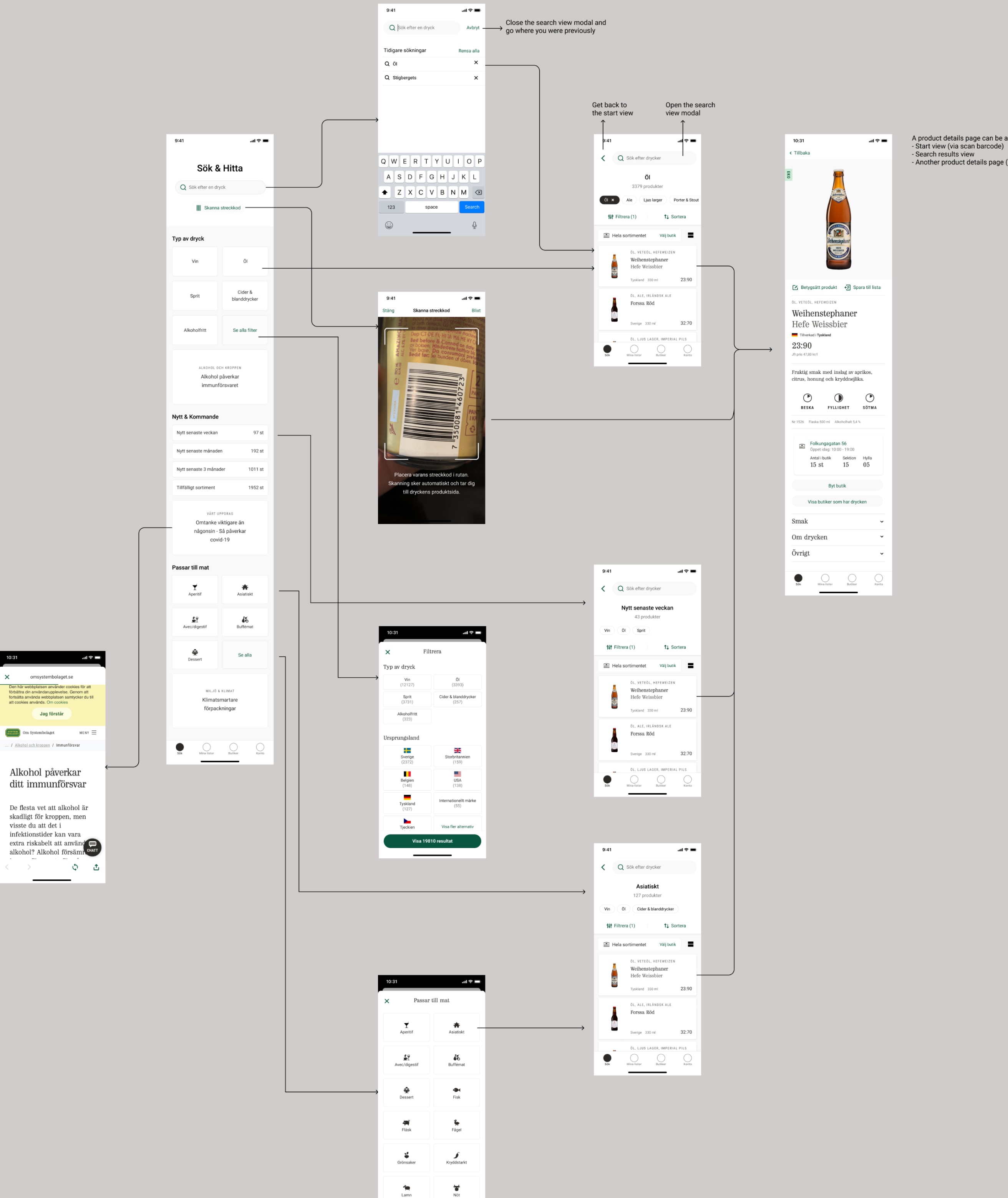
Find products and check availability
Search by name, type, or origin and confirm stock at the right store.
Locate products in store
Know which aisle a product is in, not just that the store carries it.
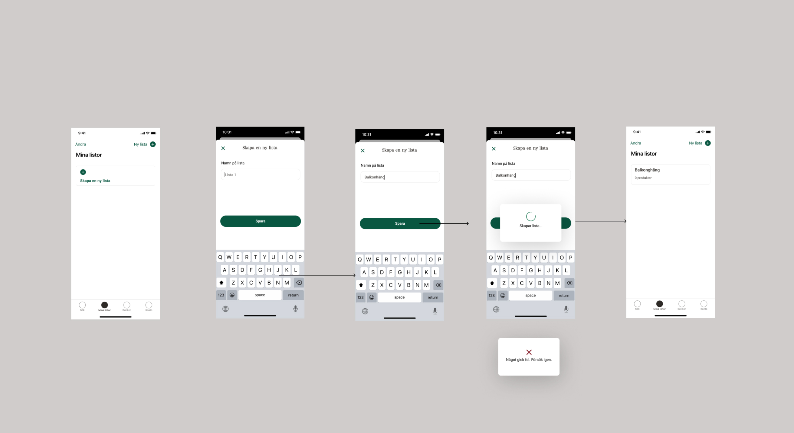
Create and manage shopping lists
Build lists in the app and have them stay in sync with the website.
Save and rate favourites
Track products they love and share opinions through ratings.
What the research exposed
Lists not synced
Shopping lists created on the app didn't carry through to the website. For customers who planned across devices, the feature was effectively broken.
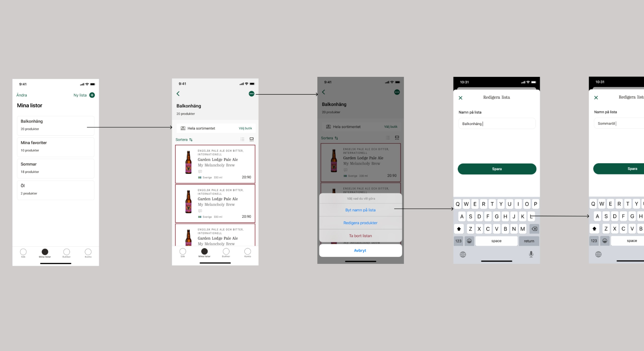
Too many steps to save a product
Adding a product to a list required navigating three separate views. The friction was high enough that most users had stopped trying.
Visual misalignment with the web
The app and Systembolaget.se had diverged across colour, typography, and component patterns. Switching between them felt like using a different company's product.
Feature clutter
Navigation carried several functions that almost nobody used. The noise made the genuinely useful features harder to find.
Store selection was broken
Customers who shopped at specific locations had to re-select their store repeatedly. The mechanism for setting a preferred location was buried and unclear.
Product discovery lacked logic
Search and category browsing didn't map to how customers actually think about finding a drink. Filters were hidden and hard to apply.
Ratings hidden behind a gesture
Product ratings, one of the most trusted purchase signals, were only accessible via a swipe almost nobody discovered.
What I shipped
Synced shopping lists
I redesigned the list architecture to sync state across app and web in real time. Lists became reliable across devices for the first time.
Simplified add-to-list flow
I reduced the add-to-list action to a single visible control on the product page. Usage climbed significantly after launch.
Unified visual language
I aligned the app to Systembolaget.se across colour, type, and component patterns, and documented the decisions as a shared reference for both platforms.
Decluttered navigation
I audited every navigation item against usage data and cut the ones that weren't earning their place. Fewer choices made the right ones findable.
Redesigned store selection
I rebuilt the store flow around search and a map-first view. Customers could find and switch locations in two taps instead of six.
Rebuilt product discovery
I restructured search, filters, and category browsing around the mental models we observed in research. Finding a specific product, or exploring a category, went from opaque to immediate.
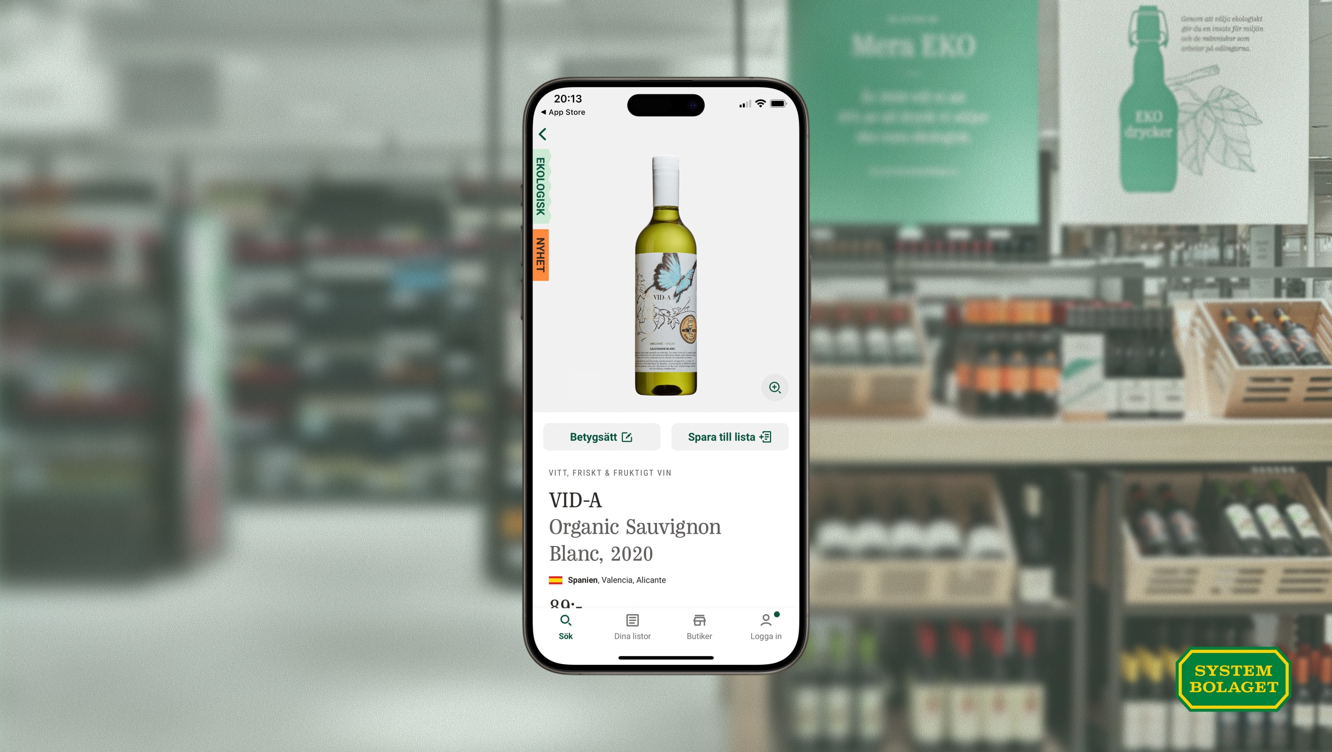
Visible ratings
I moved product ratings from a hidden swipe gesture to a persistent control on the product page. Engagement with ratings climbed immediately post-launch.
Bringing design into product decisions
Shared the backlog with the PO
Working with the product owner on backlog priorities meant design context was in the room when scope and sequencing got decided. Requirements got shaped together rather than handed over.
Design discussions moved earlier
When tradeoffs came up between scope, timing, and quality, the team had design input from the start. That removed a common source of late-stage rework — and meant engineering and design were solving the same problem.
The work landed closer to intent
Issues surfaced before they became expensive. Fewer decisions needed renegotiation during implementation. The team shipped something that matched what we'd planned to ship.
Outcomes
+960%
Usage growth post-launch: from near-zero engagement to a product people actively opened.
400,000
Monthly active users. Every goal on the brief was met and validated through usability testing.
New baseline
The redesign set the quality standard for all subsequent digital work across Systembolaget's platform.
Next case
Redesigning e-commerce for 74.9M annual visits under regulatory constraint