CASE STUDY
How design strategy took Fundler from NPS -4 to +19
Product Design Lead at a Swedish investment app for 60,000 retail investors. I owned the experience vision, built the design system across three products, and moved NPS from -4 to +19.
Fundler set out to make investing accessible to people who don't already speak the language of finance. By the time I joined in September 2022, the team had shipped a lot: three live products, 60,000 customers, ~600M SEK in AUM, all built in a phase where speed had mattered more than coherence.
The next chapter needed a different gear. One cohesive product, a shared design surface, and tighter cross-functional working. NPS was negative. Customer activity was lower than the team wanted. The brief from the CEO was to take design ownership across the company and lift the experience to match Fundler's ambition.
The problem
An audience excluded by complexity
Our stated audience was first-time and casual investors — people who wanted to grow their savings without becoming finance hobbyists. First-time investors aren't underserved by complexity. They're excluded by it.
A design, product, and organisational failure
The product was speaking a slightly more advanced language than that audience could comfortably follow. It showed up as friction in onboarding, drop-offs in KYC, and uneven trust across the experience. This wasn't a design problem in isolation. It needed to be solved together.
Strategic decisions
Audience clarity over feature breadth
Together with product and the CEO, we committed to a beginner-first product. That meant prioritising legibility, trust, and a small number of confident actions over the breadth of options the platform technically supported. The trade-off was real: power-user surfaces had to be deprioritised, and some earlier investments had to be set aside.
Design system before more features
We faced a choice between shipping features faster and laying down a system that the rebrand and the next year of work could live on. We chose the system. Short-term it slowed individual feature delivery. Medium-term it gave every team a coherent surface to design against, and made the rebrand structural rather than cosmetic.
Identity as a strategic conversation
Marketing and product had different views on visual direction. The argument looked like type and colour, but it was really about who Fundler was for. I ran it as a working partnership rather than a top-down call. It took longer than dictating the answer would have, but it produced an identity the whole company stood behind.
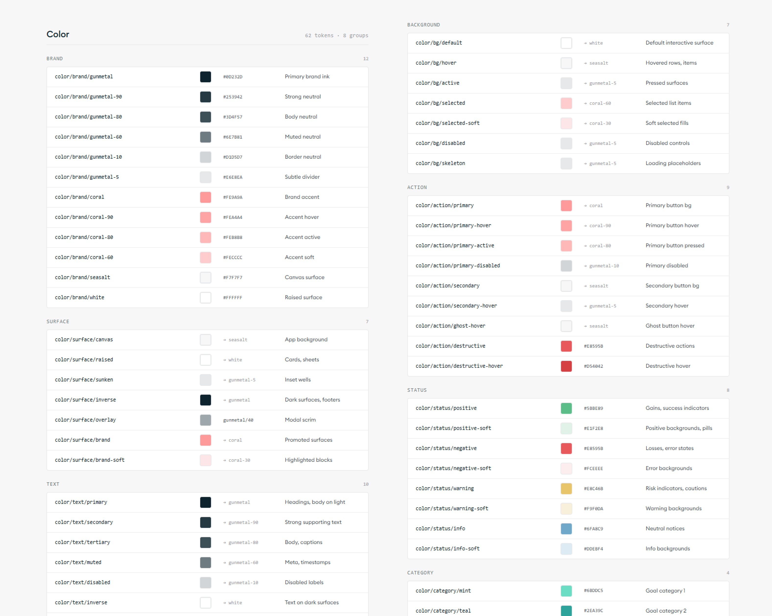
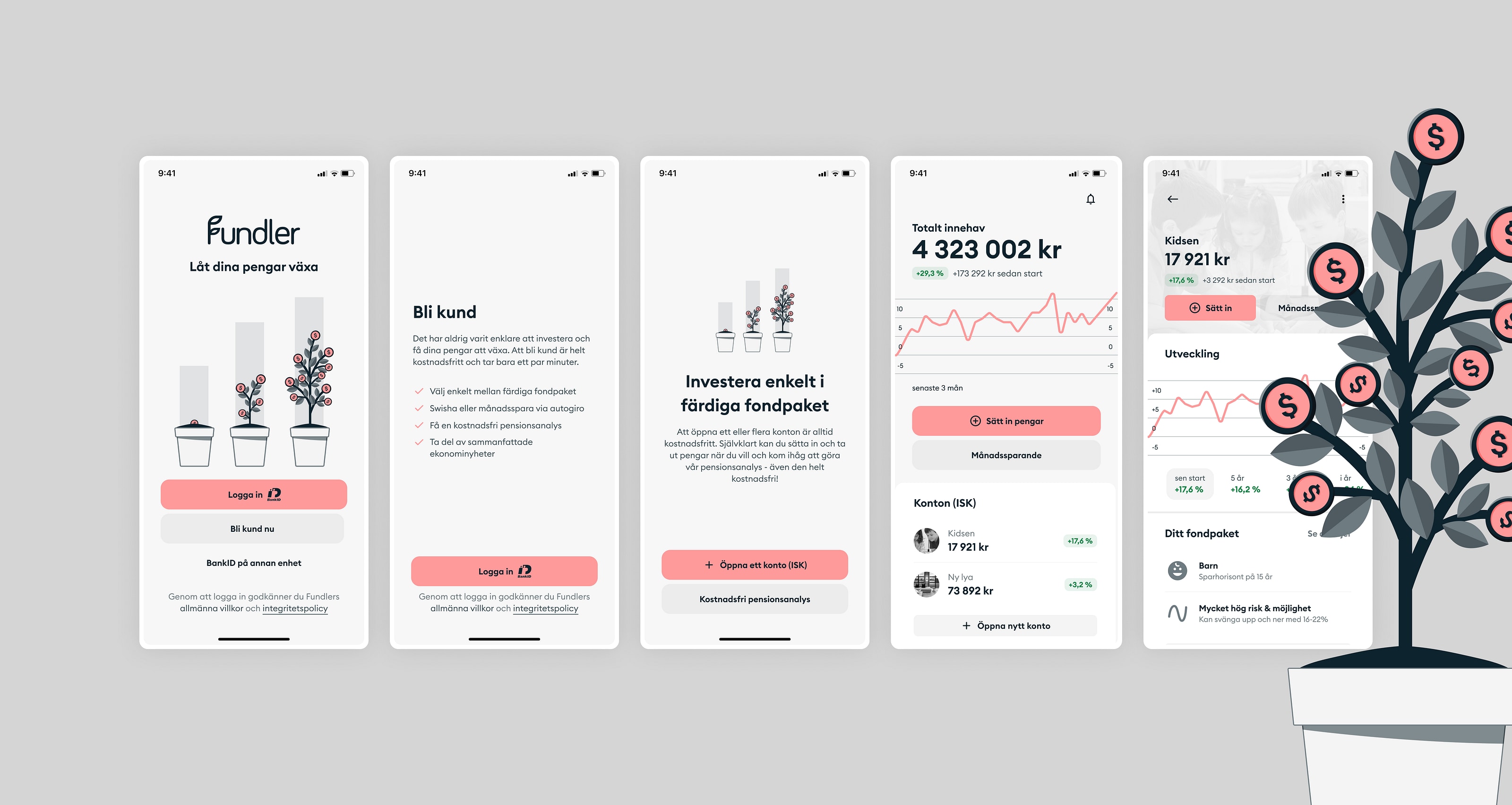
Fundler design system · 214 tokens across 14 categories
What I shipped
Experience vision
Set a beginner-first product direction: simpler language, lighter information density, fewer entry points into advanced functionality. This framing shaped what we shipped and what we deprioritised.
Design system
Built from scratch across all three products: ISK, Pension, and Endowment Insurance. Tokens, components, interaction patterns. Gave engineering a stable surface and shortened build cycles for new features.
Rebrand partnership
Partnered with marketing to move the visual language from a traditional banking expression to a more inspiring investment-tech identity. Joint decisions on typography, colour and tone of voice.
KYC overhaul
Worked with Product Owners and our compliance consultant to restructure the flow for both regulatory soundness and human readability. Design owned the structure, the language and the moments of trust.
Cross-functional rhythm
Stood up a recurring cadence between product, design and engineering: shared principles, scoping sessions framed around customer value. Decisions started landing faster, with fewer people in the room.
Designer mentoring
Coached designers across product and marketing on craft, decisions and cross-functional partnership. A force multiplier on a small team, without a people-management remit.
Before
After

Before
After
Outcomes
NPS +19
From -4 to +19 across all three products within 12 months of joining.
~1B SEK
AUM grew from ~600M to ~1B SEK during my 18-month tenure.
Lifts
Measurable improvements across new customer acquisition, KYC completion and first-deposit conversion.
One system
Shorter time-to-market across all three products from the design system.
What I learned
The company closed in 2024
Fundler closed roughly 18 months after I joined. The product and design work had moved every metric we owned, but the macro caught the company. As the downturn set in, investors retreated and the runway didn't refill. Including this matters: the work shipped, the numbers moved, and the timing was outside any team's control.
A KPI lift is not a strategic position
I learned to read a company's strategic context — funding stage, runway, market cycle, board posture — as part of the brief from week one, not as something the C-suite handles while I do design. Design without that context is craft, not consequence.
What they said
"Simon was one of the highest-leverage hires we made at Fundler. He joined when our product had drifted from its audience and NPS was negative. He repositioned it for first-time investors, built a design system across all three of our products, led the rebrand together with marketing and product, and raised the level of design. NPS moved from −4 to +19 and AUM grew from ~600M to ~1B SEK during his time. The lasting impact wasn't the artefacts. It was how he shaped product strategy, set the quality bar, and made the teams around him sharper and happier."

"Working with Simon at Fundler was a step change for how design and engineering operated together. He replaced ad-hoc handoffs with a shared rhythm — clearer principles, sharper scope conversations, faster cycles. Across our three apps, used by tens of thousands of Swedish private and corporate fund savers, the lift in product quality was huge."

Next case
A 960% usage lift on Systembolaget's app