CASE STUDY
230% conversion lift on BenifyDeals in three weeks
Benify operates the market's leading global benefits and rewards platform, serving HR teams and employees across 12 markets. I was brought in as a conversion specialist to diagnose why BenifyDeals was underperforming and deliver measurable uplift before Q4 closed.
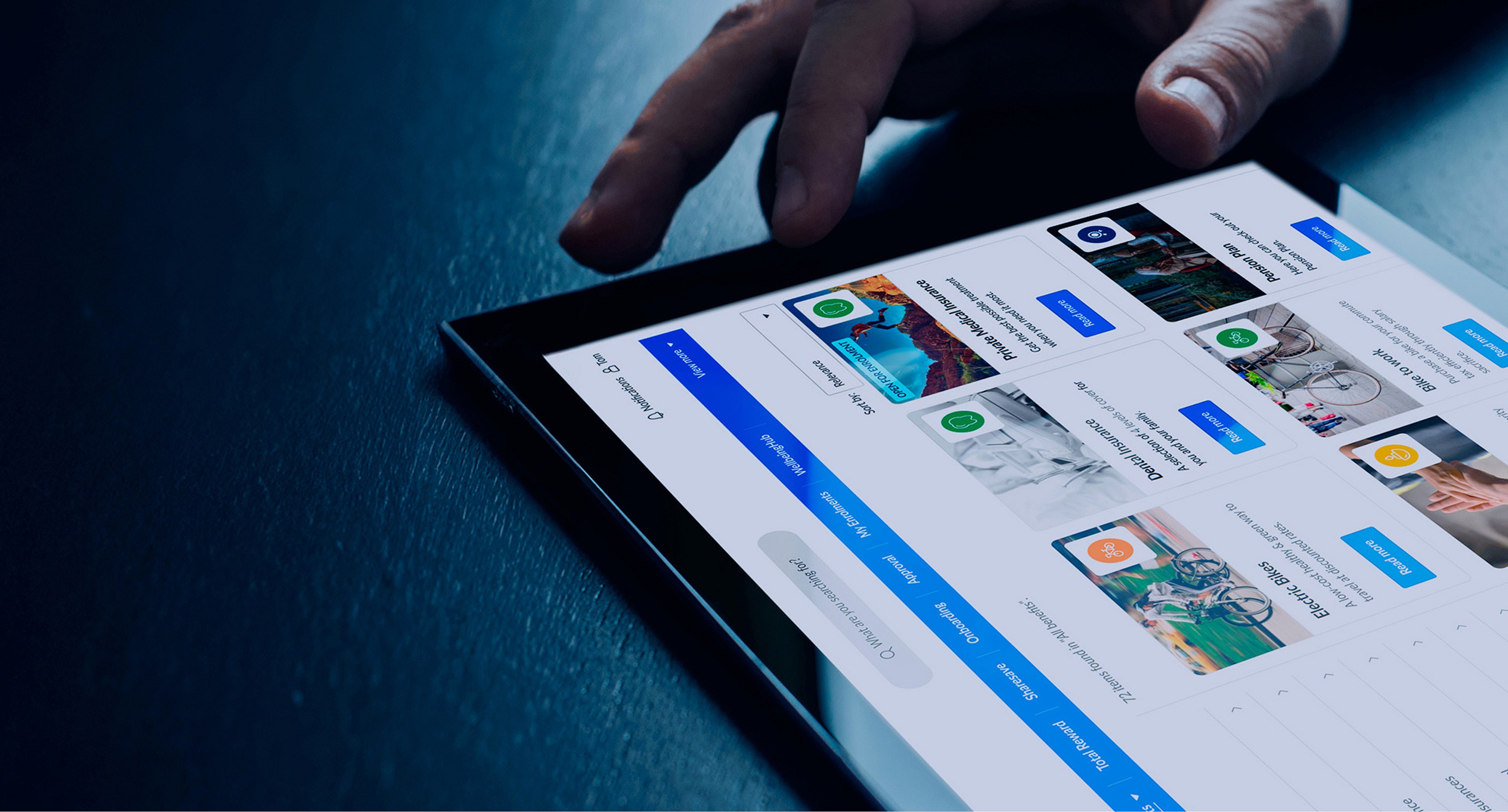
Benify came with a clear goal and a tight window: grow sales on BenifyDeals before Q4 closed. BenifyDeals is the discount and benefits marketplace embedded within the Benify platform, giving employees access to exclusive deals from hundreds of partner brands through their employer's subscription.
The engagement was time-boxed to three weeks. That constraint shaped everything: research had to generate immediately actionable findings, prioritisation had to be defensible under pressure, and designs had to be ready to test before the Q4 window closed.
The LIFT model
Relevance
Is the content and message relevant to the user? Does the page speak to their goals rather than the product?
Clarity
Is it clear what is being offered and how to proceed? Are the value proposition and call to action immediately understood?
Urgency
Does the experience create a reason to act now? Are time-limited offers and deal validity communicated effectively?
Distraction
What is competing for attention that could prevent conversion? Navigation, visual noise, and competing calls to action all bleed focus.
Anxiety
What might make a user hesitate or distrust the product? Unclear logos, unfamiliar branding, and missing social proof all generate friction.
How I ran the engagement
Understand
I ran qualitative usability testing and interviews with both new users and existing customers. This produced two distinct data sets: where experienced users had developed workarounds, and where new users failed outright. I layered in Google Analytics data to validate which failure points had the highest traffic volume, and ran a competitive analysis to identify patterns users were already bringing as expectations to BenifyDeals.
Improve
From the research, I generated hypotheses for each prioritised problem. Each hypothesis stated what was broken, why, what change would address it, and what metric would confirm improvement. I then produced wireframes applying the solutions, keeping scope tight enough that each change could be isolated in a test.
Validate
A/B tests were run on the highest-impact changes. Post-test analysis confirmed the conversion impact before any change was recommended for full implementation. This meant the team had both the designs and the evidence to prioritise development work with confidence.
What the evaluation revealed
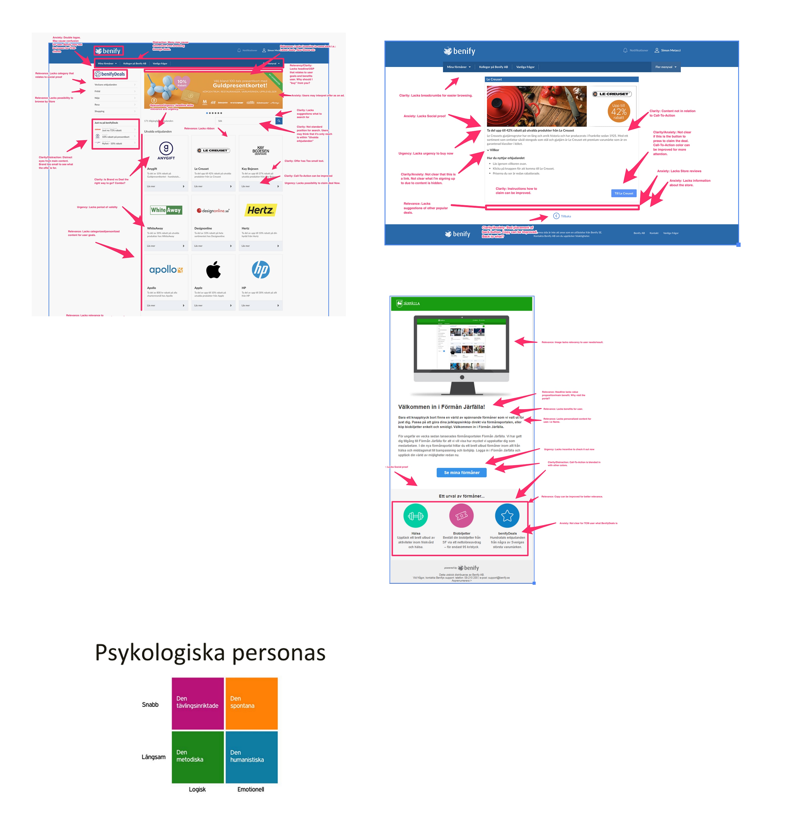
No clear value proposition on entry
The homepage lacked a headline or USP that connected to user goals. Visitors had no immediate reason to engage with the deals.
Double logos creating brand confusion
The presence of both the Benify and BenifyDeals logos caused anxiety, particularly for users who came through employer-specific channels and did not recognise both brands.
Navigation competing with content
The top navigation drew attention away from deals rather than toward them, reducing time on the sections that drove revenue.
No urgency signals on deals
Validity periods were absent from deal cards. Users had no reason to act now rather than later, and "later" typically meant not at all.
Search was hard to find and unclear
The search input was in a non-standard position and carried no placeholder guidance. Users either missed it or did not understand its scope.
Call-to-action copy was generic
CTAs like "Mer information" did not communicate what would happen next or give users confidence to proceed through to the partner site.
Personalisation and relevance were absent
The homepage showed the same content to all users. There was no mechanism to surface deals relevant to a user's categories, history, or employer context.
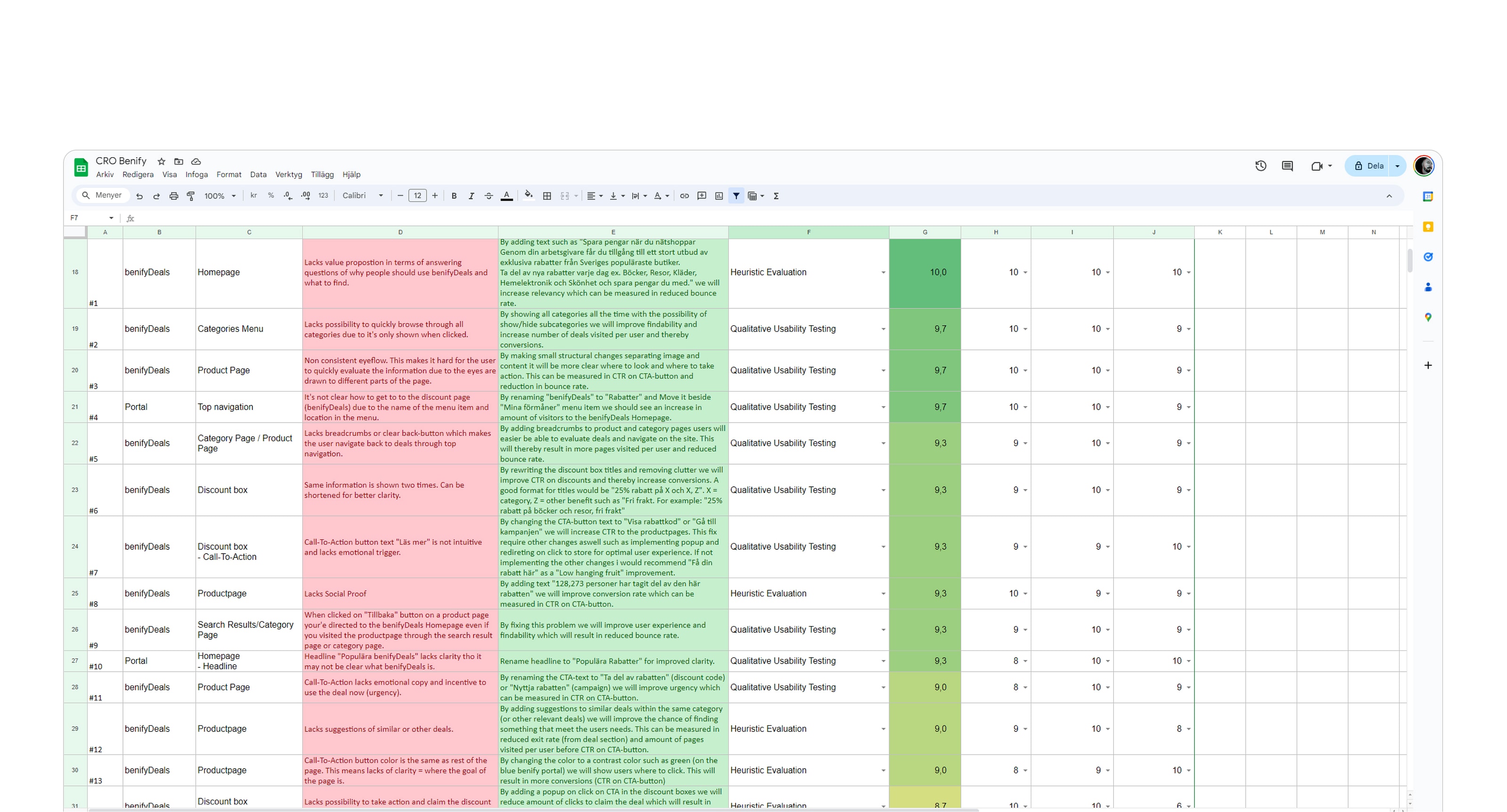
Prioritising for impact
A backlog of nearly 100 improvements
The heuristic evaluation, usability testing, and analytics collectively surfaced close to 100 distinct improvement areas across the BenifyDeals journey. Without a prioritisation framework, that volume would be counterproductive rather than useful.
PIE scoring for a defensible shipping order
I applied the PIE framework to score every improvement across three dimensions: Potential (how much could this move the conversion metric?), Impact (how many users does this affect?), and Ease (how complex is this to implement?). The ranked list gave product and engineering a defensible sequence balancing quick wins with higher-effort improvements.
Quick wins first, validated by A/B tests
Top-ranked changes shared a common pattern: clarity and relevance fixes on high-traffic surfaces with low implementation complexity. A/B tests confirmed both the improvements and the prioritisation logic, giving the team the evidence to move forward with confidence.
What I'd carry forward
Diagnostic frameworks before design begins
Using LIFT to categorise problems meant every design decision had a clear rationale tied to a specific conversion lever. Stakeholder alignment was significantly faster: no debates about whether something "felt" right, because each change was connected to a named friction type with supporting evidence.
Qual and quant together, not in isolation
Usability sessions surfaced the emotional friction: confusion, hesitation, distrust. Analytics confirmed which of those moments occurred at volume. Neither data set alone would have produced the same prioritisation. The combination is what made the PIE scores defensible rather than subjective.
Time constraints sharpen prioritisation
Three weeks forced a discipline that longer engagements often lack. Every hour had to produce something usable. That pressure is uncomfortable, but it eliminates over-research and under-shipping. I'd impose a similar constraint artificially on future conversion engagements, even when the timeline doesn't demand it.
Build the measurement plan before the first workshop
We defined success metrics early, but not early enough. On a project this fast, having analytics instrumentation confirmed before research begins means findings can be immediately cross-referenced against real traffic data. That connection between qualitative insight and quantitative confirmation is where the highest-confidence prioritisation decisions come from.
Outcomes
+230%
Conversion boost delivered within the Q4 window, measured against the pre-engagement baseline.
~100
Identified improvement areas across the full BenifyDeals user journey, desktop and mobile, scored by the PIE framework.
3 weeks
From first stakeholder session to delivered designs, prioritised action plan, and validated hypotheses.
Next case
How design strategy took Fundler from NPS -4 to +19